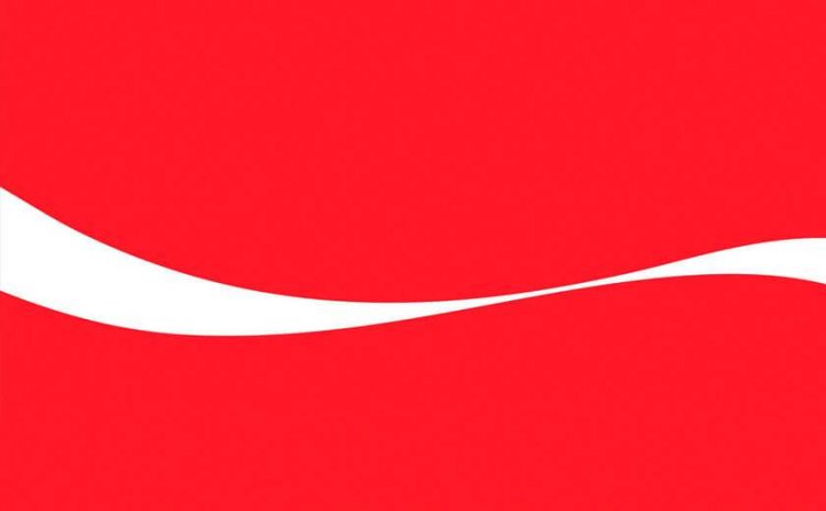
Who has such strong brand recognition that they can afford to take an already minimalist pack design and simplify it further by removing their logo? Coca-Cola can. And they did.
While some of Coca-Cola’s cans have gone logo-less, they’re certainly not without branding. With such strong brand recognition on a global scale, the use of their iconic Coca-Cola ribbon is enough for everyone to recognise the cans.
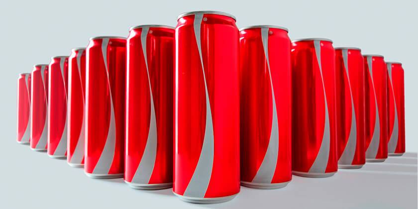
But why?
The answer lies in the message on the side of the can – “Labels are for cans, not for people”. These cans, specially created for the month of Ramadan, align with Coca-Cola’s latest campaign themed ‘Let’s take an extra second’. This new campaign invites consumers to meet each other without preconceptions or prejudice.
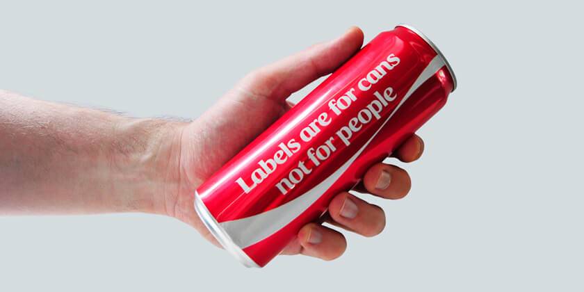
Your brand is your most valuable asset. But Coca-Cola’s enduring brand identity can afford to simplify without sacrificing a high brand salience.
With such strong brand foundations, Coca-Cola can maintain their recognition through a red can and a white ribbon alone (all while supporting a positive campaign to fight prejudice). This is a testament to the strength of the Coca-Cola Red branding.
Old range, new look
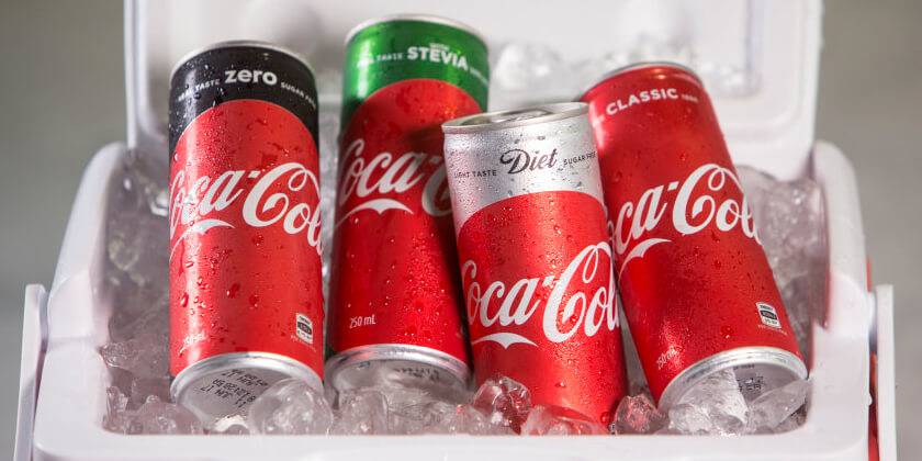
By using the strength of the Coca-Cola Red as well as placing a firm focus on the Coca-Cola logo and custom typeface, ‘TCCC Unity’ (designed by Neville Brody), the Australian Coke range has been redesigned to stand as a stronger family of products.
Diet Coke and Coke Zero are no longer being treated as separate products, but rather Coke is the focus product, and Diet, Zero, etc. are variant spins on the classic.
Consumers may be confused at first, until they realise they need to look at the range differently. Ultimately, it strengthens their key offering…Coke!
So what can brands take away from this?
Often less is more. But before you go jumping on the bandwagon and dropping your logo, remember that Coca-Cola is the world’s most recognised beverage. In order to pull this one off successfully, you’ll need to establish massive brand recognition.
In terms of product range design – best practice recommends consistency across your brand colours, typeface and logo. When redesigning, a nod to previous packaging design is key for stronger brand recognition and increased shelf presence (in Coca-Cola’s case it’s the use of previous product colours).
Whatever it is your brand needs, we can deliver – because at NOUS, brands are what we make. If you would like to discuss your brand strategy with us, please feel free to get in touch at [email protected].


