How to Ensure Your Brand Colours Match Online and In Print
So you’ve got your smashing new logo design. Now you want to use it! But how do you keep your branding looking consistent in both print and on screen?
First let’s look at some important factors that affect colour.
How Does Colour Get Perceived?
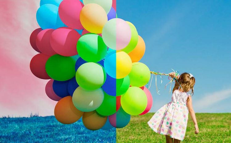
There are a number of elements that affect the perceived look of a colour including the observer’s range of colour vision and the viewing conditions.
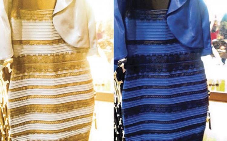
Each person sees colour a bit differently. Do you remember the dress? Did you see it as Black and Blue or White and Gold… there were some people who saw the colours change before their eyes, due to changes in lighting conditions, monitors and the way their brain understood the range of colours.
The base cause of the discrepancy in viewing the colours of the dress was the lack of white balance in the image. Meaning that the underlying tones or neutral colours of the image were not colour corrected, and held a hue that caused people to perceive the overall colour differently. Not a good look for your logo or keeping branding consistent.
Different Colour Spaces
Most people are aware of RGB and CMYK colours but may not know the impact this can make on your image or design.
RGB is a mix of Red, Green and Blue light, and when all colours are at full and equal brightness white light is produced. In essence, you need to add more colour to get lighter results, and to make a colour darker, you need to remove some of it. This is how most computer monitor images are produced.
In printing, it is the opposite. Using the Cyan, Magenta, Yellow and Kohl (Black) inks, the more you apply, the less light is reflected back to your eye and thus the darker the colours appear, so it is a subtractive model of colour. To achieve white in printing requires the absence of colour, since each ink essentially absorbs or subtracts different colour spectrums from the reflected light.
RGB light sources, due to their brightness and purity are able to render more vivid colours than CMYK inks allow. The range of colours achievable within each colour model is called the colour gamut. When converting from one colour model to the other, there will be some slight discrepancies that may need to be adjusted. You may find that your bright orange logo looks great in RGB but much duller when printed in CMYK, since that colour is outside the CMYK colour gamut. This is where special inks are useful, such as the Pantone range of colours: Pantone Orange 021 C – ahhh much brighter!
White Point
This can be defined loosely as the position of the lack of colour in a printed image or the combination of all colours for images on a screen. It is used as the base to balance the colours in your image, to be able to adjust hues and tones to achieve the desired result.
Depending on the material your proof is printed on, or the screen you are using to look at the image, there can be a colour cast that you are viewing it through which makes colour adjustments unrealistic for the desired outcome.
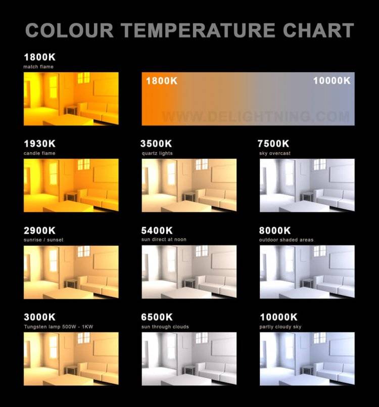
Monitors and Lighting Conditions
Monitors are able to be calibrated in a number of ways, included the level of brightness, and contrast, or through colour temperature which is measured in Kelvin. When looking at a proof on your screen it may vary greatly to what it looks like on your designer’s screen. For this reason, it is not recommended to approve colour for a print job by “soft-proofing” (viewing on a monitor screen) unless you have a monitor and viewing conditions specifically calibrated for this purpose. In most cases a hard copy ISO-standard pre-press proof will be far more accurate for making any colour assessments. It’s important to note that these proofs are limited in how accurately they can show special colours such as Pantones. You should refer to a Pantone book (Coated or Uncoated as appropriate) for an example of how these colours will look.
Another important detail to consider when viewing printer proofs is the ambient lighting, as well as surrounding colours. Offices generally have tungsten lighting, which creates a yellowish cast on the colour and can show vastly different results, making it not the ideal climate for colour editing or correction. Before requiring colour changes, perhaps check it against daylight to see if there is a change in the way it looks to you or other people in your office. If in doubt, discuss with your design company or printer.
To get an idea of how different lighting affects your proofs, see the image below showing the way different lighting and times of day can change the colour cast of a room.
Paper Stocks
Paper varies in its tone and hues, meaning the white point of your image can be affected through not using a pure white base. The amount of white paints available in a hardware store are mind boggling, and just help to show what one person considers white may not be the same as the next.
This is where doing printing press checks under controlled lighting conditions can assist with the consistency of the finished product. Also having knowledge of what the inks will do on the various stocks aids in bringing professional results.
Remember that printing on uncoated paper and coated paper with the same inks and image will produce vastly different results because of how the ink sits on, or is absorbed by the paper, as well as the reflective qualities of the finish (gloss versus satin. Adding varnishes and celloglazing will alter the colour further.
How Then Do You Keep Consistency?
There is no way to keep the colour both on screen and off screen to be 100% exactly the same, due to the different method of lighting, screens, stock and inks. Some simple ideas that can help include using accepted colour target standards such as Pantone colours and sticking to a particular paper stock for your branded pieces. If your brand colours are printing on a new paper stock you can arrange a “drawdown” of that ink through your printer (basically a solid test print of the ink on the actual stock) to see how the colour looks, prior to the actual print run.
The good news is that if your design company is worth their salt, they can advise you on how to get results that are as accurate as possible and ensure that people see your images as they are meant to be across all digital and print mediums.
Tap into their experience and they’ll help create and champion your brand standards, helping to build trust and authenticity through protecting your brand’s presentation and image both online and offline.