Very early on in the design process we established the importance of Newstead as a brand in connecting and consolidating the story of each brew into a single-minded range of packs. The name, history and identifying colour of each beer had been established with the design of the range of bottled beers a few years earlier. What was needed was a sense of order, some kind of structure that would allow us to breathe life into each story, but still make it fit as part of a range.
By drilling down into the true Brisbane story of each beer we were able to determine a key geographic location for each … creating an order-of-appearance along and around the looping Brisbane river. Using a graphic of the stretch of river between St Lucia and Hamilton we designed a tone-on-tone facing for each can, so that positioning them together formed a “map” of Newstead Brewing’s Brisbane and its stories. A sense of “piecing a puzzle together”, or “try the whole range” pervades any group of packs that link strongly together — definitely a goal for the Newstead cans.
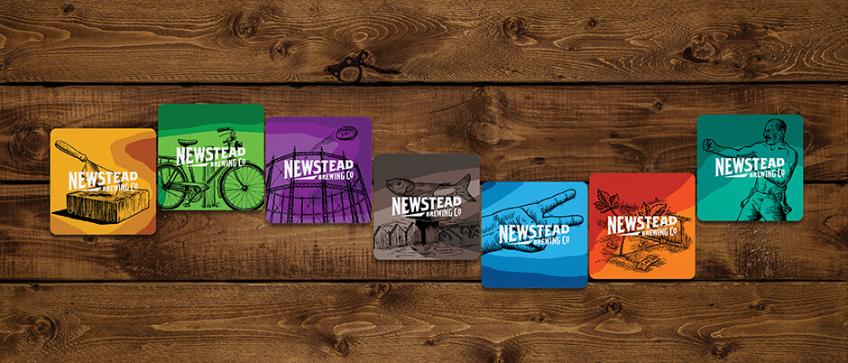
Newstead’s brand has always been about playing a bit of the larrikin, being a little ambiguous and avoiding the obvious. So whilst geo points are highlighted on each pack, only oblique hints are given to their actual locations. Illustrations on the facings are sometimes obtuse, sometimes straightforward, and allow each beer to begin to tell its own story. Beer names are individualised by a signature execution, referencing the story, its era, or just being different to the pack next to it. Back-of-pack stories are told in a winding yarn style, with understatement and laconic charm.
From a retail perspective, each pack needed to be able to stand on its own, with zero context, so the colour palette was ramped up, shaking off the muted colours of the old bottle labels, and delivering powerful shelf presence, as a range and individually.
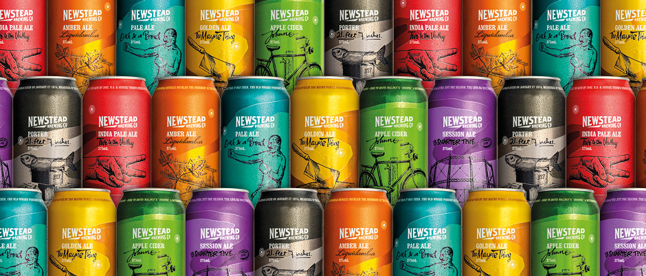
Strong, colourful, quirky and unafraid these new packs are a banner for the next phase Newstead Brewing Co. — and the new breed of craft brewer. Consumers respond, the beers deliver and everyone goes home just a little bit happier